Introduction and user interface
Note: The successor to OS X 10.10 Yosemite, OS X 10.11 El Capitan, can be downloaded from the Mac App store. It introduces a ton of new features including a split-screen view, Spaces Bar and under-the-hood performance improvements. Not sure if you want to upgrade? Check out our OS X 10.11 El Capitan review. If you’re interested in what might be coming after El Capitan, here is everything we know about OS X 10.12, which is likely to be unveiled at WWDC 201 in June.
Original review follows…
Yosemite is the second version of OS X since its reboot last year, when Apple switched from naming its annual OS X updates after big cats to places in California. It also neatly side-stepped the problem of where to go after 10.9 by avoiding the use of numbers altogether (although they do still exist in the geekier parts of the OS like System Information, where Yosemite is referred to as OS X 10.10).
So, what’s new? Quite a lot, actually, and nearly all of it in the name of greater consistency between OS X and iOS. That’s not to say that Apple is gradually merging the two operating systems – there’s no evidence at all that’s on the agenda. Nevertheless, several alterations and additions in Yosemite do tie OS X more closely with iOS 8.
Even in the early days of its tenure, Yosemite can already be counted as a success in one way. According to metrics company Net Applications, Yosemite accounted for 36.6% of all instances of OS X, setting a new Mac adoption record in the process. Like OS X 10.9 Mavericks that came before it, Yosemite was made available as a free download, racing out of the traps on October 16. In comparison, Mavericks, which hit the App Store on October 22, 2013, gained a Mac-only user share of 32% after its first month of availability.
Apple has released an update to Yosemite, bringing the operating system to version OS X 10.10.3. The new update brings a number of performance improvements, bug fixes, enterprise features, support for the new Force Touch touchpad, a new Photos app, improvements to Wi-Fi and Bluetooth performance and more racial diversity with emoji. Additionally, 10.10.3 expands the number of supported Macs that can use 4K, 5K and Ultra HD TVs.
Interface
The most obvious change, visually at least, is the new interface. Yosemite does to the Mac what iOS 7 did to the iPhone and iPad. Its user interface is flatter – though not flat, there are still drop shadows and other nods to the third dimension, it’s just that now they exist for a purpose rather than being merely eye candy. No more glassy textures.

There’s more translucency in Yosemite than its predecessor, Mavericks. Where once it was limited to the Finder’s menu bar, it now pops up in lots of places, including Finder menus and the sidebar of Finder windows. It’s been tweaked so that the underlying image is blurred and less distracting than in Mavericks, but we suspect it will still be a love it or hate it feature. If you do hate it, you can ‘reduce’ it in the Accessibility pane of System Preferences.
Perhaps the most controversial change in Yosemite’s user interface, however, is the switch in font from Lucida Grande to Helvetica Neue – another alignment with iOS. It takes a bit of getting used to, and for some it will never be right, but we found ourselves warming to it over time.
Some of OS X’s application icons have changed to resemble their iOS counterparts. iTunes, for example, now has a red icon instead of a blue one.
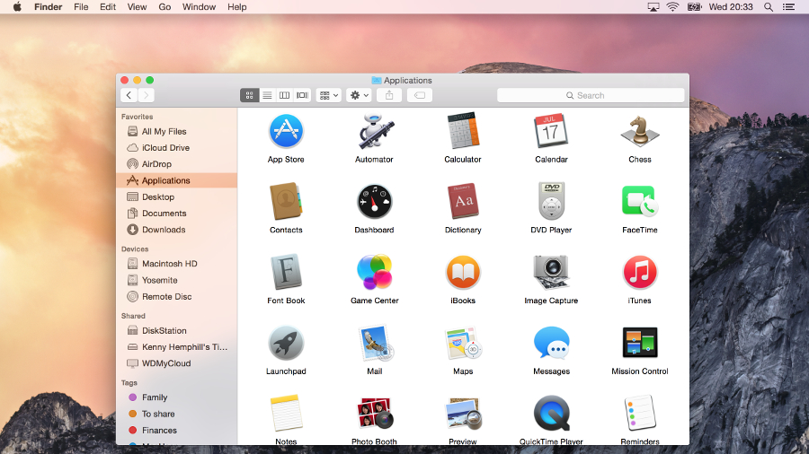
Finder
Not a huge amount has changed here, but there is one key addition: iCloud Drive. Your iCloud storage drive now shows up in the Finder and you can drag and drop files and folders to it just like any other location. It also displays the files you’ve opted to store there from apps like Pages, Numbers, and Text Edit.

Folders are now a brighter blue, but Apple hasn’t taken the opportunity to rethink its confusing implementation of tags, which is a great disappointment. For those of us who used to mark Finder files and folders with a specific colour to indicate action that needed to be taken, for example, the tagging system is an irritation more than an aid.
Dock
The shelf has gone, which will be a great relief to many, and the Dock has now reverted back to its original format, a rectangle. Not so good is the loss of the Dock preferences from the Apple menu – to change things like magnification or show/hide, you must now pay a visit to System Preferences. However, on the plus side, the dock is fairly customisable using a free app called cDock, which allows you to change the dock’s theme, add spacers, show only active apps and more.
Windows and buttons
The traffic light buttons at the top left of windows have, like everything else in Yosemite, lost their glassy texture and are now flat matte red, amber, and green. But there’s a more significant change – the green button now acts, by default, as the full-screen switch in apps that support full-screen use. The arrows at the top right corner of windows are gone. In apps that don’t support full-screen operation, the green button reverts to its regular duty of maximising windows. Holding down the Option (Alt) key also switches the green button from full-screen to maximise.
Dark Mode
Brand new in Yosemite is Dark Mode, which turns some aspects of the OS a much darker shade of grey, to make it more comfortable to use your Mac in dim lighting. These include the Finder menu bar, Dock, and application switcher. During the beta period some elements of Dark Mode, such as Finder menus, were poorly implemented, and it remains to be seen whether they have been fixed in time for the full release.
Spotlight, Safari and iTunes
Notification Centre
Hands up if you used Notification Centre in Mavericks? No, us neither. But Yosemite makes it much more interesting by adding a Today panel that works in a similar way to iOS 8’s Notification Centre. It displays your Calendar appointments, the weather, world clock, and other elements you choose. And it supports third party widgets too. Oh, and it’s another OS X element to be given the translucent treatment.

Spotlight
Spotlight in Yosemite is unrecognisable from its predecessors. Where once it slid almost apologetically into view underneath the magnifying glass on the menu bar, it now leaps into action in the centre of the screen. It looks, and operates, much more like a launcher such as Launch Bar, Quicksilver, or Alfred, than Spotlight of yore.
There’s a good reason for the change, however; Spotlight is now much more useful than it used to be. It hooks into online data sources to pull out information and display it on-screen. Type in the name of a movie, for example, and you’ll get a thumbnail image and a plot summary with credits courtesy of Wikipedia. Type in the name of a restaurant or hotel, and Spotlight will display a snippet of a map, along with details of the establishment and reviews from Yelp.
For local files, it displays inline previews of documents and, as before, can be used in lieu of a calculator when you’re in a hurry. It might just be enough to tempt you away from your favourite launcher.

Safari
Update: OS X 10.10 Yosemite can now update to Safari 9, which adds a new mute audio feature for tabs in addition to new viewing options for Safari Reader. It also brings improvements to privacy, compatibility and security, according to Apple.
The first impression Safari makes when launched is that it’s smaller and lighter than it used to be. Apple has reduced the height of the menu bar and the result is the loss of toolbar favourites. They no longer display by default, though you can switch them back on again from the Bookmarks menu.
New tabs now open with a display of tabs from the Favourites folder, rather than Top Sites. And those Favourites tabs appear again when you start to type in the address bar. A new tab switcher, accessed by pressing a button on the menu bar which is identical to the tab switcher in iOS, displays open tabs from all the devices connected to your iCloud account in the main window. You can navigate to any open tab, or close tabs on other devices.
The only other items on the sparse toolbar are a share icon, again identical to the iOS 8 share button, navigation arrows, and a button to show or hide the left-hand pane which displays Bookmarks, Reading List, and Shared Links. There’s no Home button.

The address bar is now even smarter, though, and works similarly to Spotlight. Movie titles display snippets from Wikipedia under the address bar, and hotels and restaurants show the same details as Spotlight. Click once and you’re given a more detailed preview, click again and you’re taken to the relevant website.
iTunes
Besides the new icon, iTunes has had its interface overhauled. The Albums view looks even smarter than it did before, with better use of album covers’ predominant colours for backgrounds. And the Artists view now gets a similar treatment to Albums.

Navigation has been made less intrusive. There are only three options at the top of the window now: My Music, Playlists, and iTunes Store. View options are now in a dropdown menu on the right, and Movies and TV Programmes, along with other content, have been moved from a dropdown menu to icons on the toolbar. By default, only music, movies, and TV shows are shown, but an Extras menu item allows you to add more.
The iTunes Store has had an overhaul too, and is now as clean and crisp as everything else in Yosemite. Here too, navigation has changed, though not necessarily for the better. It took us a bit of poking around to find out how to get to the App Store, for example. It turned out that it’s hidden by default and you need to enable it from the same Extras menu that you use in the Library to view additional content there.

It seems as though Apple has deprecated the App Store in iTunes, at least in terms of making it easy to access, perhaps in recognition that many of us now buy iOS apps directly from the iOS App Store rather than iTunes.
There’s still no sign of iTunes Radio in the UK.
Messages, Photo, Calendar and Continuity
At first glance, very little has changed in Mail, aside from the user interface. It handles threaded messages slightly differently, displaying the first name and initial of everyone in the thread in the preview, rather than just that of the most recent sender.
There are, however, two important new features. The first is Mail Drop, which allows you to send multi-gigabyte attachments (up to 5GB) by first sending them to iCloud and then allowing the recipient to download them at their leisure.

The second new feature is a poster child for Yosemite’s Extensions, a feature which allows third parties to add functionality to Yosemite apps and features, in a similar way to iOS 8’s Extensions. This one’s called Markup and allows you to annotate image attachments from within Mail.
Photo
No – you haven’t spotted a typo – Photo is OS X Yosemite’s new application for photos that is set to replace iPhoto in Yosemite. iPhoto is currently the default app for photo management, but Photo, which was introduced in the OS X Yosemite 10.10.3 beta in February, is expected to replace it when the update is pushed out to users. Photo showcases a much more streamlined view of your snaps and allows you to push your full-resolution photos to iCloud, making them available on every Apple device. In addition to viewing imags, Photo has Aperture-like editing capabilities that are likely to appeal to starting out photographers.
Messages and FaceTime
Messages gets the same flat speech bubbles as iOS 8. That, however, is the least significant change. You can now send SMS messages directly from Messages to any phone, as long as you have an iPhone connected to your iCloud account on the same Wi-Fi network.
Likewise, FaceTime now allows you to make and receive telephone calls on your Mac, using your iPhone as a proxy.
In Messages, you can now remove yourself from busy threads, switch on Do Not Disturb to mute notifications, and send audio snippets as well as text or images.
Calendar
Day view in Calendar now uses the right-hand side of the window to display details about any event or appointment you click on, with the left-hand side showing the full day, hour by hour. It looks great and is very useful, but comes at the expense of the multi-day appointment display that used to inhabit the left-hand side of Day view.

Continuity
The ability to use Messages and FaceTime for SMS messages and phone calls is part of what Apple calls Continuity. The theory is that you should be able to use whichever device – Mac, iPhone, or iPad – you want at any time, and accomplish anything on one you could do on another.
Handoff is another aspect of Continuity. The idea is that you could, say, start typing an email on your Mac, and then pick it up on your iPhone and carry on, without ever having to close or save it, or think about how to do this.
It works like this: whenever you have a handoff compatible app open on an iOS device nearby (hardware and software compatibility allowing), the app’s icon appears to the left of the Dock. Click on it and you open the OS X equivalent app and continue working on the open document. The other way round, the icon appears on iOS 8’s Lock screen or at the very left of the app switcher and you tap it to call up the document.
It’s a very clever and very useful feature, but does some nifty behind the scenes work that uses both Wi-Fi and Bluetooth 4.0. So to use it, and other Continuity features, you’ll need a device and a Mac that supports the latest version of Bluetooth. That means an iPhone 5 or later, iPad 4 or later, including the iPad mini, or an iPod touch 5th generation. Apple started introducing Bluetooth 4 in the Mac on the mid-2011 MacBook Air – but you’ll need to check if your specific Mac supports it.
We tested it using the public beta of Yosemite with iOS 8.0.2 on a Retina MacBook Pro and it worked pretty well both ways round. It did take a bit of fiddling to get it to work the first time, and trying to figure out where the icon on iOS had gone after the Lock screen disappeared took a few minutes (it’s to the left of the current app in the app switcher, so obscured when you initially invoke the switcher), but nevertheless, it worked.
The other aspect of Continuity is AirDrop. Where previously you could AirDrop files between Macs or between iOS devices, you can now swap them between Mac and iOS devices.
AirPlay
Yosemite allows Mac users to ‘mirror’ the Mac’s audio and video output to an Apple TV without either being on a Wi-Fi network. The two devices can create a peer-to-peer network to connect with each other. However, you’ll have to have the most recent Apple TV, released in March 2013, as older models don’t support the feature. And you still can’t mirror an iOS device on a Mac’s display in order to, for example, watch video stored on your iPad on your iMac screen.
Verdict
We liked
Continuity is an excellent addition, and the ability to make and receive phone calls from your Mac in particular is something we’ve been waiting for since the advent of Bluetooth a decade ago.
iCloud Drive is also overdue, particularly for those of us who pay for additional storage, and it’s good to see that it’s as easy to use as Dropbox or OneDrive. The Today view transforms Notification Centre and we can’t wait to see what developers do with Extensions.
We disliked
Apple introduced tags with Mavericks. We didn’t like the implementation then, and the way it hijacked colour coding, and we still don’t. Handoff, while great, isn’t intuitive and it’s easy to become frustrated when trying to get it to work.
There seems to be no reason for the removal of Dock preferences from the Apple menu, and while it’s a minor irritation, it’s an irritation nonetheless. And the ability to AirPlay to, rather than just from, a Mac looks like it must remain on the wish-list for at least another year.
Final verdict
Yosemite is as big a deal for the Mac as iOS 7 was for the iPhone and iPad. Visually it takes a bit of getting used to, and there will no doubt be a period of bedding in as Apple smooths out one or two rough edges. If you were a fan of glassy textures and 3D tropes, you’ll be disappointed. For the rest of us, however, the user interface is cleaner, crisper and looks particularly stunning on Retina displays.
User interface aside, the biggest news is the ever-tightening link between Apple’s two operating systems. If you’re uneasy with being ‘locked in’ to Apple’s universe, prepare to be very uncomfortable.
Apple’s mission is clear: it wants to make swapping between iOS and OS X as seamless as possible, while retaining the strengths of each platform. That involves compromises, however, and one of them is using iCloud and an Apple ID for all your stuff. If you can live with that, Yosemite is very good indeed.
Source: techradar.com


I do not recommend the Yosemite upgrade for anyone using the mail application, especially when doing multiple "to"s, or "cc"s, or "bcc"s…and a multitude of other weird things that it indulges in. For example: hiding the 'active' menu line of word under the Finder menu bar…making it so that you have to reboot word to get to the doc you had on the screen…and a bunch more oddities that keep popping up…such as Bluetooth no longer being available for no reason….indeed, it is as if changes were made just for the sake of change, and so much has been lost in the process….moving buttons for no reason…eliminating certain functions such as "Bounce" in mail….I tell y'all stay away from this garbage OS. We need the spirit of Jobs back in the operating systems!
where did you come up with the iPhone numbers, and why bash something you obviously dont have
You gave this 4 stars!! It's not user friendly which is what Apple is suppose to be known for. I hate it! I am rarely on my Apple pc anymore as I can't do what I want with my pictures and can't even download anything from my camera. For those of us not overly computer literate this is a kick in the face. Not happy with the photo thingy on my Alienware pc either( I know it's not an apple product)..feels like the consumer doesn't matter anymore! Apple should realize this and bring iphoto back!
I thought it was Yoss-e-might
It's the result of Apple hiring MS programmers. All the good Apple programmers left a long time ago with pockets full of money.
After reading the comments, if Techradar wasnt paid off, the guy that gave it 4 stars is probably on a written warning now lol
I finally gave in and upgraded to Yosemite. It's not as awful as many are saying, but I do hate that it will make my browser window go full screen, and will not allow me to resize the window so I can view two windows side by side, at least not while posting a message. So I can't check on the definition of a word, or copy and paste a link, without the first window sliding off the screen. Still trying to find the controls to stop a problem that was never before a problem in 20 years of owning Macs. Macs are becoming more invasive (https://theintercept.com/2015/… and less user friendly.
We'll see if there are other ways Yosemite represents steps backwards.
Why does it take so long for my laptop to open up now that I have installed Yosemite? I always loved the fact that I would press the power button and it was ready to go..
not now!! Answers would be appreciated.
I tried Yosemite twice and downgraded to Mavericks for the second time and I refuse to budge! The 3D look is sleek and cool, why did they mess with it? I found myself having to look online to get tips on how to get it to act like it USED to. I shouldn't have to do that. I don't like the fact that Apple want to copy all the other products to exact detail when designing the UI of Macs. Microsoft tried that with Windows 8 by making the PC like a tablet which is crazy in my opinion. Most of all, you really need a retina display for Yosemite. My 2014 iMac 21.5 inch display has no retina enhancement so icons in Yosemite look like they were drawn-on my screen by a maniacal child with a crayon. It looks RUBBISH.
Wow did I just step into a whinery or something? What's all the fuss about? I'm running Yosemite, it's fast, it's clean — I'm even running it on my Mac Pro 1,1 WHICH ISNT EVEN SUPPORTED — I had to use a hack to get it to run. And guess what, Yosemite's running FASTER than Lion did. Yep, that's right, just leapt form Lion to Yosemite on a Mac Pro 1,1. So whatever y'alls issues are, grab a lollipop, shut up, and suck.
How about an upgrade for the entry level iMac? It's been awhile and the pace of the 2011 model is slowing.
I'm so sorry..but i think the only way, is to search on torrent for last version of the iPhoto…Apple is going down..fast. 4 years ago i buyer my first Mac with SL on him…it was epic, now i'm so disappointed..
Wrecked my Logic install… good luck!
I have a 2011 IMac 27" and I am still running Lion 10.7.5. I downloaded Photoshop elements and it requires 10.8. Now I am afraid to do any upgrading because of the problems I am hearing…suggestions? My machine has 8 memory. Thank you.
Man up lol!
I dont miss Snow Leopard… I've downgraded to it on both my machines… it felt like an old friend came back
And I think the cat names are more perfect now then ever before.
Cats are born all mongy and slow after too much inbreeding… kinda like trying mate a phone with a computer for too long
And you could reply to an sms on your Mac 3 years ago if you have an Android phone
Probably not…. do not believe everything you read on a tin!
My thoughts exactly. We all work hard to pay heaps of cash for these products and we shouldn't have to run around the block when they change something.
Hate it, I waited till they announced the next "improvement", and thought they must have fixed any bugs in Yosemite by now………..nope! This whole computer upgrade bullshit is nothing but a techie Ponzi scheme!
Even simple stuff like 'File> Save As' is broken (It now saves both copies instead of leaving the original un-modified) Apple obviously knew about the issue, but instead of fixing it they have just HIDDEN it from the menu!
(Hold down the 'Option' key to find 'Save As' again)
It also seems to run particularly bad on 2011 Macbook Pro's and some Mac Mini's.
They should have named it OS X Beachball
Windows ME had better performance!
it's funny reading about how a computer should LOOK instead of how it should PERFORM. Mac fails in both cases – AGAIN!
I am so happy that I am still resisting the call to upgrade to Yoso. Love my Mac with Mav as it is and reading all the reviews below I was right to resist.
I updated mine, can someone help? overtime I log in I have to type my logins and passwords to the websites I navigate, I don't like this update. What's going on here, is this a bad update? I'm not happy